Prussian Blue Paint
Today, Prussian Blue. The University of Houston's College of Engineering presents this series about the machines that make our civilization run, and the people whose ingenuity created them.
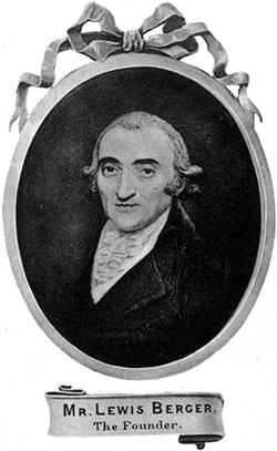
 Here are two related books: Thomas Berger's 1910 account of his great-great-grandfather, Lewis Berger, and the family's historic paint factory. The other is Michel Pastoureau's book on the color Blue. Berger's book begins in 1760 with Louis Steinberger moving to London from Frankfurt. He carries with him a new method for making the paint pigment we call Prussian Blue. He's soon selling pigments and other commodities. Then he marries an English woman and changes his name to Lewis Berger.
The other book is all about blue pigments, which were hard to create. We find no blue in Neolithic cave paintings and it's rare in art of the ancient world. I visited a medieval book preservationist, a while back, and found him laboriously grinding up lapis lazuli as his first step in creating authentic medieval blue ink.
The rich color called Prussian Blue came into being by accident in the very early 18th century. A Berlin pigment-maker bought some potash to use in making his red pigment. His supplier, a scoundrel named Dippel, sent him a bad batch. Lo and behold, it yielded a brilliant blue instead of red. When Dippel learned what'd happened, he began selling the new pigment. He called it Berlin Blue, and claimed to've made it with his "secret process."
Then a British chemist named Woodward identified it as potassium ferric cyanide. Dippel's secret was out. Bankrupted, he went to Sweden and somehow became the King's physician. His lethal medications got him kicked out of Sweden. He eventually landed in a Danish prison; but he'd launched an industry.

Prussian Blue swatch (courtesy of Wikipedia)
But, back to Lewis Berger: He became a premier British pigment supplier. He also developed a brilliant green. Some of those paints proved to be unstable over time. However the business prospered. Great-great-grandson Thomas's book is an unabashed puff piece, no doubt, but small bombshells appear. One grandson was an artist -- perhaps a better artist than chemist. He was working in the company lab one day and suffering from a raging toothache. Seeking relief, he reached for the wrong bottle and poisoned himself.
Berger's colors were used on structures as well as canvas -- for house paint and oil paint alike. They account for the eerie blue skies of landscape artist J. M. W. Turner. They were used by impressionists who followed him. But Thomas Berger is better tuned to the beauty of his company. It's no surprise that my copy is inscribed, not to an artist, but to a supplier.
Well, I can't fault him for that. His first concern had to be with the product. Indeed, my first familiarity with Prussian Blue came not from Turner, nor the impressionists. It came from the blueprints that lay at the center of my early life. The designer who created the cover of my latest book must've sensed that. For his palette, he chose the dark-hued Prussian blue of the old drawings -- those blueprints to the construction of our brave new 20th century.
I'm John Lienhard, at the University of Houston, where we're interested in the way inventive minds work.
T. B. Berger, A Century & a Half of the House of Berger. (London: Waterlow & Sons Ltd., 1910)
M. Pastoureau, Blue: The History of a Color. (Princeton, NJ: Princeton University Press, 2001)
More on Prussian Blue: https://en.wikipedia.org/wiki/Prussian_blue
