Visual Display of Information
Today, let's figure out how to plot a graph. The University of Houston's College of Engineering presents this series about the machines that make our civilization run, and the people whose ingenuity created them.
Yale professor Edward Tufte has long argued that to be understood, data must be seen -- not just read. Facts alone tell us little. Facts need context. We need to build the right display case to explain (or even to understand) our own data.
Example: Suppose the Dow-Jones Index has risen slowly over a month's time. Then, on Thursday, it falls 80 points. Nothing verydramatic there. Eighty points out of 8000 is only one percent. But the next day the newspaper plots the month's history. To make changes clear, they use a range from 7800 to 8200 points.
Now that one-percent drop looks like the Grand Canyon, and naive readers panic. A faulty display of perfectly valid data has led people far away from what the data really say.
So Tufte turns to Richard Feynman dipping an O-ring into ice water at the senate hearings on the Challenger disaster. Testimony about effects of temperature on O-ring material had been droning on. It was no secret that an O-ring had lost elasticity needed to seal a joint. Yet the fact had not really been made clear.
Then Feynman clamped an O-ring and forced it into a glass of ice water so it was bent. When he withdrew it, it didn't spring back. Cold had robbed it of its function. Suddenly laymen understood in their guts what data had failed to tell their heads.
Still, that demonstration, like the Dow-Jones graph, was flawed. Remember, data need context. What is normal behavior for an O-ring? We should force a second O-ring into a glass of room-temperature water. We need to know normality to understand abnormality. Feynman succeeded, but it wasn't rigorous science.
Data need contexts. Years ago a friend who wrote music-history texts looked at me sadly and said,
You know, John, we do it wrong in music schools. We expose our students to Bach, Josquin, Mozart. How can they develop their powers of discrimination without hearing bad music as well?
That always struck me as being powerfully insightful. Information removed from any useful backdrop is meaningless.
Tufte returns to the Challenger failure. Why didn't engineers and managers scrub the launch? Not only were O-ring properties well known, but so was a previous history of trouble. So he plots a graph. He shows the extent of O-ring damage on previous launches as a function of ambient temperature at launch time. The curve rises stomach-wrenchingly as the temperature falls. And on January 27, 1986, the temperature was far lower than it had ever been.
But he plotted that graph in hindsight. It wasn't there at the time. Tufte finishes with guidelines for visual displays. Keep cause and effect in mind, document your sources, and so forth. But one last bit of advice lurks behind the rest. It is: see what others cannot see. And that is never easy advice to follow.
I'm John Lienhard, at the University of Houston, where we're interested in the way inventive minds work.
(Theme music)
Tufte, E. R., Visual and statistical Thinking: Displays of Evidence for Making Decisions. Cheshire, CT: Graphics Press, 1997.
The music professor I mention was William E. Brandt, Washington State University. He has written many music-appreciation texts. He made this remark not long after he published The Way of Music, Boston: Allyn and Bacon, 1963.

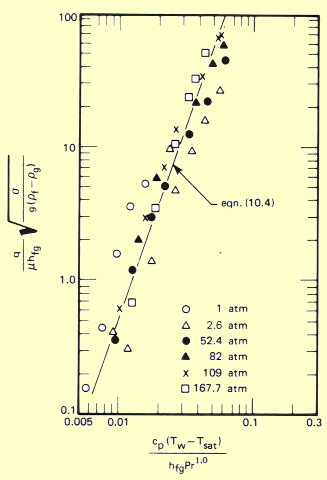
A classic example of a distorted representation of data. Nucleate boiling heat transfer (plotted on the vertical axis) appears to be well represented by the equation (the steep slanted line). In fact, the logarithmic coordinates create a distorted sense of well-being. Many of the data deviate from the curve by two or three hundred percent (from A Heat Transfer Textbook by J. H. Lienhard IV and J. H. Lienhard V)