Durer's Roman Letters
Today, let us write in CAPITAL LETTERS. The University of Houston's College of Engineering presents this series about the machines that make our civilization run, and the people whose ingenuity created them.
In a world of word-processing, you and I pay increasing attention to the appearance of our typed output. I use a Courier font for text to be read aloud or edited. But I usually use Times Roman for correspondence and for other final copy.
The Times Roman font is named after the old Roman letters. But they were only upper case. For lower case, we use the Carolingian alphabet. It was developed long after Rome -- in around 800 AD -- in the court of Charlemagne. The Times Roman font includes both cases, even though lower case letters are not Roman at all.
Still, all the Times Roman letters, upper and lower case alike, are formed according to instructions given us in 1525 AD. And the person who wrote those instructions might be a surprise.
He was the great Renaissance artist Albrecht Dürer. Dürer presented his patron, Wilibald Pirckheimer, with a book on geometry. In his preface, he laments the number of earnest young artists who are producing junk, because they haven't learned the geometry of perspective and proportion. He begins a section On The Just Shaping of Letters with these words:
... since architects, painters and others ... are wont to set an inscription on lofty walls, it will make for the merit of the work that they form the letters correctly.
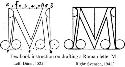
Dürer sets down general precepts for forming letters. Then he gives specific instructions for each letter. Each is to occupy a square. Line widths vary from one thirtieth to one tenth of the side of the square. Decorative serifs on the letters are formed about arcs. And the arc diameters are also specified as fractions of the square. Each letter involves geometrical exercises done with a compass and a straightedge.
When we're done, we've been given a truly lovely and graceful set of capital letters. But we've also had a short course on the combined esthetics and mathematics of composition. Dürer's letters are beautiful because he understood balance and proportion in a way that he could explain. If we look closely at Dürer's etchings and paintings, we realize that they incorporate the same principles.
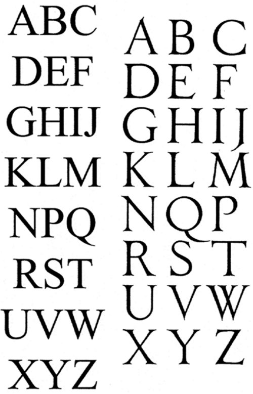
So I place this five-century-old treatise alongside a set of Times Roman capital letters, printed out large. I can hardly tell them apart! For Dürer had set the standard around which all the fine press fonts orbit, even today.
When I was first studying drafting and descriptive geometry (though I did not know it then) I was studying Dürer. Not only were his letters included as exercises, but I was also learning to lay out sheet metal patterns, and design duct intersections, in accordance with his instructions.
Well, of course I was. Dürer himself intended me to. Here's something else that he said,
I hope that no wise man will defame this laborious task of mine, since [I undertake it on] behalf of all who love the Liberal Arts. [Not for] painters alone but for [all] who use compass and rule, and measuring line -- that it may serve to their utility.
I'm John Lienhard, at the University of Houston, where we're interested in the way inventive minds work.
A. Dürer, Underweysung der Messung, mit dem Zirckel un Richtscheyt, in Linien. (Nuremberg: 1525). The section on forming letters is reproduced in English in: A. Dürer, Of the Just Shaping of Letters. (tr. R. T. Nichol) New York: Dover Publications, Inc. 1965.
You may also find instructions for forming the Roman capital letters by Dürer's method in C. L. Svenson, Drafting for Engineers. 2nd ed., New York: D. van Nostrand Co., Inc. 1941, pg. 75.
Below, left: Times Roman capital letters. Right: Dürer's capital letters

